
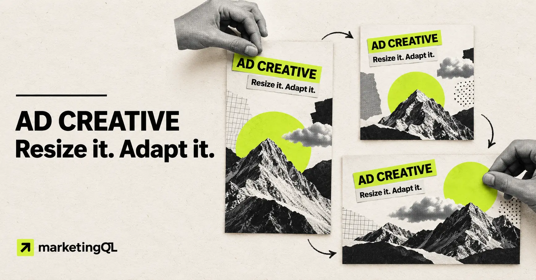
You approve a square ad. Then the production request expands: portrait for the feed, landscape for another channel, and a few display sizes.
It is tempting to call all of that resizing. Sometimes it is. Often the design needs more than a new canvas and a smaller font.
I would separate the work into three buckets: resizing, adapting, and creating a new concept. That distinction helps the designer estimate the request, keeps review focused, and makes it less likely that a strong idea turns into a weak set of exports.
Resizing changes the file. Adaptation protects the idea.
A resize keeps the composition mostly intact. The canvas changes, the elements scale, and the final file meets the placement requirements.
An adaptation keeps the core message and visual direction, but deliberately recomposes the ad for the new space. The headline may move. The product image may use a different crop. Supporting copy may shorten. The visual hierarchy may shift so the ad is still readable at the size and speed of the placement.
A new concept changes the idea itself. It may lead with a different problem, use a different proof point, or show a different visual story. That is not a resize request, even if the final dimensions happen to be the same.
Use a resize when the composition still works
A simple resize is reasonable when the new aspect ratio is close to the approved design, the important elements already sit inside a flexible area, and the copy stays readable without being compressed.
For example, a 1200 × 1200 square design may only need a straightforward export at another square dimension. A landscape design with plenty of negative space may also tolerate a nearby landscape size without changing the hierarchy.
I would still check the actual exported file. A technically valid image can have a headline that is too small, a logo that competes with the message, or a product crop that no longer makes sense.
Adapt when the shape changes the reading order
The more the aspect ratio changes, the more likely the ad needs a real layout decision.
A portrait feed ad has vertical room. A landscape ad has horizontal room. A narrow display banner may give you almost no room for secondary information. Scaling the same layout uniformly can leave dead space in one version and crowded copy in another.
Meta notes that placements support different aspect ratios and provides placement-level creative customization. Its guidance also calls out safe zones for placements where interface elements can cover the image. That is a layout problem, not just an export setting. See Meta’s current guidance on aspect ratios by placement and safe zones for Stories and Reels.
LinkedIn single-image ads can appear across desktop, mobile, and the LinkedIn Audience Network. Its current single-image ad specifications cover landscape, square, and vertical options. I would not assume one composition will read equally well across all three.
A hypothetical adaptation: one idea, three layouts
Hypothetical example: a B2B reporting product is promoting one message, “See every campaign in one view.” The offer, audience, proof point, and landing page stay the same. Only the placement changes.
ANNOTATED STATIC-AD EXAMPLE
Keep the message. Recompose the layout.
1 / SQUARE MASTER
ONE VIEW.
- Balanced headline and product visual
- Room for one short proof point
- Primary review direction
2 / PORTRAIT ADAPTATION
ONE VIEW.
- Headline moves higher
- Product visual gets more vertical space
- Key elements stay clear of the lower edge
3 / LANDSCAPE ADAPTATION
ONE VIEW.
- Headline and product split left to right
- Supporting detail is removed
- Focal point uses the wider frame
The message does not change, so this is one concept with two placement adaptations. It would become a new concept if the landscape version introduced a different problem, claim, or visual story.
Do not force composed social ads into every Google format
Google responsive display ads work differently from a finished social graphic. You provide separate images, logos, headlines, and descriptions, and Google combines them across available inventory.
Google’s current responsive display ad specifications require landscape and square marketing images and set separate requirements for logo assets. Its creative guidance recommends clean, high-quality images and warns against overlaying a logo on the image.
If the approved Meta ad has a headline, logo, button, and product image baked into one canvas, the right Google request may be to extract a clean image asset and supply the copy separately. That is an adaptation to the ad format. Shrinking the composed social ad into a square file would miss how the responsive system actually uses the assets.
Decide what stays fixed before production starts
A useful adaptation brief should separate the locked parts of the idea from the elements the designer can change.
I would lock:
- The audience and campaign goal
- The main message and approved claim
- The offer, CTA, and destination
- The visual concept and required brand elements
- The test variable, if this is part of a controlled creative test
I would let the designer adjust:
- Element position and scale
- Image crop or approved alternate crop
- Headline line breaks
- Supporting copy that can be shortened or removed
- Spacing, contrast, and the emphasis needed for the placement
If the message is still being debated, I would not produce every size yet. Approve the core direction first. Otherwise, one copy change can create a second round of work across every adaptation.
Brief the placement, not just the pixel dimensions
“Make this 1080 × 1080” tells the designer the file size. It does not say where the file will run or how it should behave.
Include the platform, ad format, placement, ratio, final dimensions, file type, and current specification link. Add a screenshot or wireframe of the placement when the surrounding interface matters. Mark which elements are required and which can move.
For each requested version, answer:
- Is this a direct resize, a layout adaptation, or a new concept?
- What is the first thing someone should notice?
- What must stay identical to the approved direction?
- What can be shortened, cropped, moved, or removed?
- Which placement-specific overlays or safe areas need room?
- What does the exported file need to be called?
Use a simple production sequence
My starting workflow would be:
- Approve one master direction. Resolve the message, visual idea, and required brand elements before multiplying files.
- Map the actual placements. Remove sizes the media plan does not need.
- Label each deliverable. Mark it as a resize, adaptation, or new concept.
- Build the largest layout changes first. Review the portrait and landscape extremes before filling in nearby sizes.
- QA at the likely viewing size. Check hierarchy, crop, contrast, and legibility, not just dimensions.
- Export with clear names. Include concept, version, platform, placement, ratio, and revision.
- Carry campaign learning forward. If a message or visual direction earns useful downstream actions, make that the starting point for the next request.
The goal is not to redesign every ad from scratch. It is to spend design time where the placement creates a real communication problem.
Use a resize when the approved composition still works. Use an adaptation when the new frame changes the hierarchy. Ask for a new concept only when you want to test a different idea.
Sources
- Meta: Aspect ratios supported by placements
- Meta: Text overlays and safe zones
- LinkedIn: Single image ad specifications
- Google Ads: Responsive display ad specifications
- Google Ads: Responsive display creative guidance
Platform specifications and source guidance checked October 23, 2026. Verify the current requirements for your selected placements before production.