
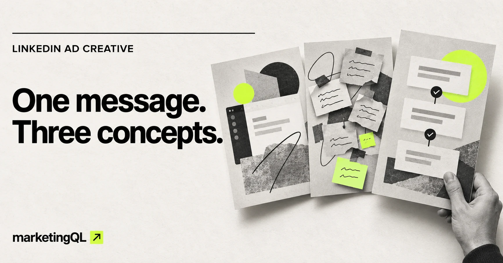
If you ask for three new LinkedIn ads and get the same layout with three different headlines, you do not have three concepts.
You have three variations of one concept. That can still be useful, but it answers a narrower question.
I would separate the work into three layers: the message, the visual concept, and the variation. Keep the approved message steady first. Then explore a few genuinely different ways to show it. Once one direction looks worth developing, create the smaller variations and placement adaptations inside that direction.
This gives the designer a clearer assignment, and it gives the campaign owner a better idea of what actually changed.
Start with one approved message
Before anyone opens a design file, write down the one idea the ad needs to communicate.
That is not the full body copy. It is the central point a person should understand from the creative. For example: “Give campaign reviewers one place to leave feedback.”
Then add the audience, offer, and next action. A simple starting brief might say:
- Audience: B2B marketing managers coordinating campaign approvals
- Message: Give reviewers one place to leave feedback
- Offer: See the product workflow
- Next action: Visit the product page
This is a hypothetical example, not a client campaign or performance claim. The goal is to show how one message can lead to more than one visual idea.
Turn the message into three visual concepts
A concept changes the organizing idea of the ad. The product, problem, and outcome can each become a different route.
Here is what that could look like for the example above.
HYPOTHETICAL LINKEDIN STATIC-AD EXAMPLE
One message, three visual concepts
Show the product
What leads: A simplified approval view with one comment thread highlighted.
Possible headline: See every approval in one place.
What it tests: Whether a concrete product view makes the message easier to understand.
Show the problem
What leads: Scattered feedback cards moving toward one organized destination.
Possible headline: Still chasing campaign feedback?
What it tests: Whether problem recognition earns more attention from the intended buyer.
Show the outcome
What leads: A clear review path ending in an approved state.
Possible headline: Get campaigns approved without the chase.
What it tests: Whether the improved workflow is more compelling than the product view or the problem.
The copy is not identical across all three, but the underlying message is. Each route gives that message a different visual entry point.
I would not call one of these the winner before launch. The point of the concept stage is to build a useful set of choices, not to pretend we already know which one will work.
A concept is not a button-color change
Once a concept is selected, you can create versions inside it.
For the product-led concept, that might mean testing two headlines, changing which part of the interface is emphasized, or trying a tighter crop. The visual idea stays the same. The execution changes.
I would label the files so the hierarchy stays visible:
- Concept: Product view
- Variation A: Product benefit headline
- Variation B: Problem-led headline
- Adaptation: Square, landscape, or vertical placement
This sounds basic, but it prevents a common reporting problem. If every file is simply called “creative version,” you cannot tell whether you learned something about the big idea or only about one line of copy.
Develop the idea before producing every size
LinkedIn currently supports landscape, square, and vertical single-image ads. Its specifications recommend 1200 by 628 pixels for landscape, 1200 by 1200 for square, and 720 by 900 for the recommended 4:5 vertical format. LinkedIn also notes that paid vertical images serve only on mobile. See the current single-image ad specifications before exporting final files.
Those sizes affect the composition, but they are not three separate concepts.
I would approve the core direction in one primary format first. Once the hierarchy is working, adapt it for the placements you actually plan to use. A landscape design may need the product view moved beside the headline. A vertical design may need a tighter crop and fewer supporting elements. That is adaptation, not resizing for its own sake.
Always review the finished ad at a realistic feed size. If the product detail, headline, or proof point disappears on a phone, the full-size design mockup is giving you the wrong impression.
Decide what kind of test you are running
There are two useful ways to launch the work, and they answer different questions.
If you need a structured comparison, LinkedIn’s Campaign Manager supports an A/B test using the ad variable. LinkedIn says both ad sets share the same settings except for the selected variable, and the ad-content option can compare different media assets or copy. Its current setup requires a minimum two-week test period. Review the current ad-variable A/B test instructions before setting one up.
If you are running several ads inside a normal campaign, delivery may not be evenly split. That setup can still help you learn, but I would not describe it as a clean A/B test.
Either way, decide what stays fixed. Keep the audience, offer, landing page, optimization goal, and measurement plan as consistent as the test allows. Then document the thing that changed.
Review the next funnel step
Click-through rate can tell you whether an ad earned attention. It cannot tell you whether the traffic was useful.
I would review the creative against the campaign’s actual next step:
- Landing-page views
- Meaningful website actions
- Lead or signup rate
- Lead quality
- Downstream sales activity, when available
If the problem-led concept gets more clicks but the product-led concept sends more qualified people to the next step, that is an important distinction. The ad is part of the path. It is not the final business outcome.
A practical production order
- Approve one clear message, audience, offer, and next action.
- Brief two or three genuinely different visual concepts.
- Review the concepts at realistic feed size.
- Choose the direction or directions worth producing.
- Create a small set of headline or layout variations inside each one.
- Adapt approved work for the LinkedIn placements you plan to use.
- Launch with a documented test setup and review what happens after the click.
If the first round is hard to brief, use the paid ad creative brief template to define the campaign question and deliverables before asking for designs.
The main thing I would avoid is jumping straight to ten files that all express the same idea. Start with a couple of real concepts. Make the differences obvious. Then use variations to develop what is worth testing next.
Sources
- LinkedIn single-image ads advertising specifications
- Create an A/B test using the ad variable in Campaign Manager
- LinkedIn A/B Testing best practices
Platform specifications and testing guidance checked October 21, 2026. Confirm current requirements in Campaign Manager before launch.